April 06, 2020
Recreating the Pokémon Red/Blue Pokédex
When I started my current job last spring, my engineering team’s onboarding curriculum involved (among other things) integrating with an external API to build a microservice in Python; I worked with the PokéAPI. I had grand plans for styling the final product that didn’t come to fruition due to time constraints, but I knew I’d want to come back to those original ideas.
In this post, I focus on my thought process while building pokedexapp.com instead of sharing code snippets tutorial-style. This is an intentional choice I’ve made with myself as a true beginner in mind: when I was first learning to code, I craved insight into how and why engineers make technical decisions when not following a tutorial - and I am still learning more about this topic all the time. I hope this post is helpful in some way to others!
Getting Started
Last month, I found myself with the time and energy to focus on a personal project, so I decided to rebuild my Pokédex app.
Decision point: What were my goals in recreating this app, besides the ’90s nostalgia factor?
I knew from the start that I wanted my app to look as similar to the original Red and Blue versions of the game as possible. I also knew I wanted to use this project to continue to practice front-end work.
Decision point: Which technologies could I use? Which were appropriate for the app’s purpose and my goals?
I considered creating a Rails backend application and then using react-on-rails for the front-end. However, since the PokéAPI is GET-only (and my application would be as well), it didn’t make sense to build a server-side application. I left behind my Rails comfort zone and decided to work with create-react-app to set up my Pokédex in React.
Design
As mentioned above, I knew I wanted my app to mimic the style of the 1990s GameBoy games as closely as possible.
Decision point: What exactly does “mimic the style of the 1990s Gameboy games” even mean?
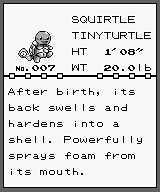
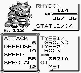
I settled on a couple key screenshots from the first generation games to use as my “wireframes”:
Throughout the development of the app, I returned to these images constantly to guide my work.
Data
Since I had used the PokéAPI before, I knew that it returns a LOT of data on a single request. I also knew that it has multiple endpoints for different and sometimes overlapping sets of information. However, I had completely forgotten where the relevant data would be in each of those.
Decision point: How did I want to approach figuring out how to work with the API’s responses?
I could’ve created the different components of the application, then fetched the gigantic response objects and messed around with them in the UI. However, that would have entangled my process for getting better at React with my need to figure out the deeply-nested API responses.
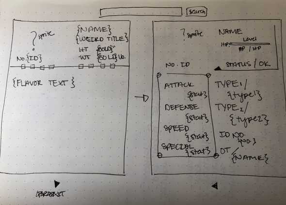
Before even touching the React app, I instead combed through the responses from two endpoints: /api/v2/pokemon/${pokemon-name} and /api/v2/pokemon-species/${pokemon-name}. This meant lots of curl requests and command-line manipulation of the JSON responses to find the data I would need to bring the “wireframes” to life. I eventually mapped the specific data roughly to where I would want things to show up in the UI.
The “wireframes” I chose were key to helping guide me through this phase of planning the project. Without them, I would have been overwhelmed by the sheer amount of information that the PokéAPI can provide.
Components
From there, I started writing code. A major goal of mine was to practice thinking through how props are passed from component to component in something a little more complex than the tutorials I’d been doing but less complex than the giant application my team maintains at work. As I got deeper into developing the components, I started losing track of how the they were working together.
Decision point: How could I make my confusion into an opportunity to think more clearly about props and state?
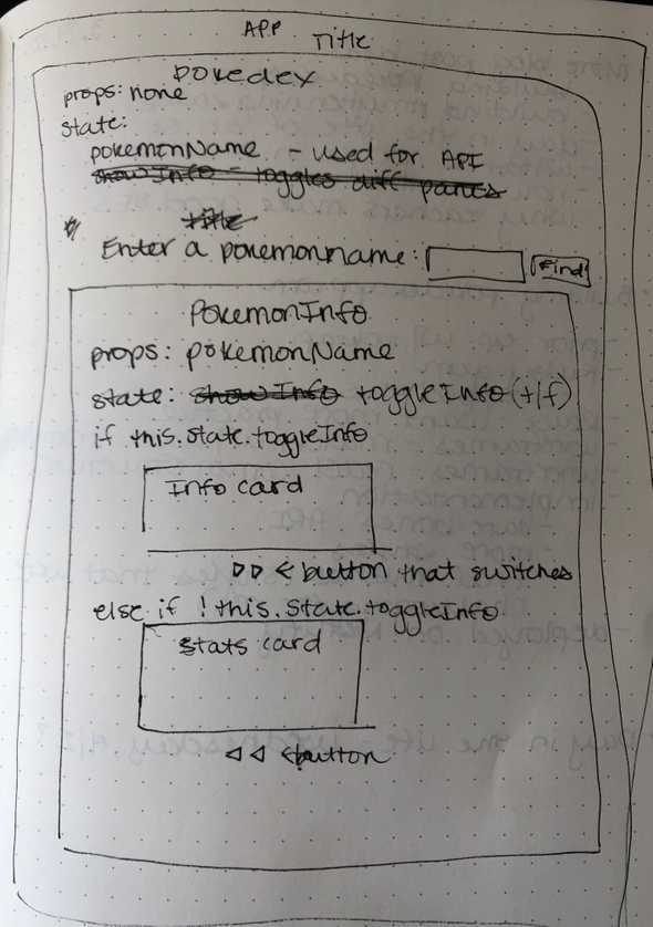
I could have gone to the old standby of Googling for similar projects and mimicking their structure. In an effort to become more self-sufficient at React and application-level decision making, I instead roughly sketched what I wanted each component to know and do in order to fulfill my vision for the app. (If you couldn’t tell already, I do a lot of my best thinking when sketching things out on paper.)
These sketches guided me to getting the app to a workable (if ugly) initial state, pulling in the right data from the API to the individual components:
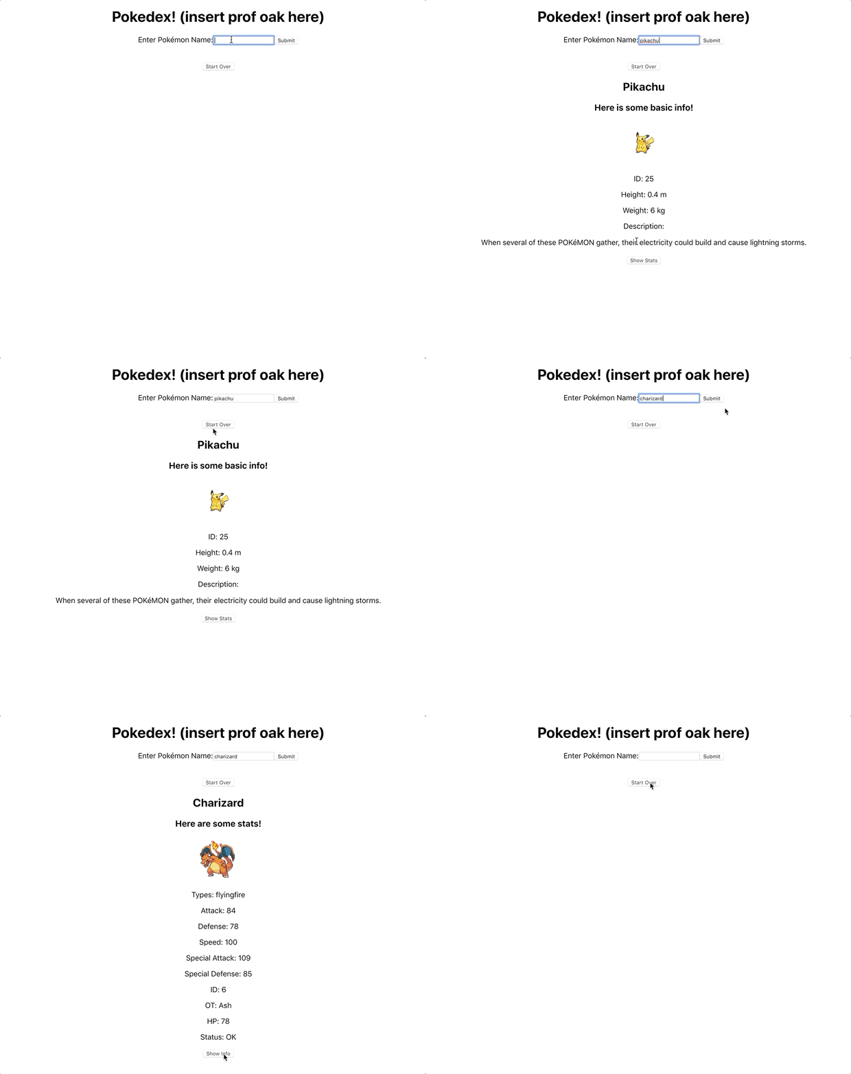
Since the minimal components were working at this point, I decided it was safe to move on to styling the app.
Styling
I will be honest - styling (if I’m doing it from scratch, as I was for this app) is, for me, usually the most time-consuming stage of developing any application. I am extremely detail-oriented, so I can end up spending a lot of time on tiny details. Knowing this about myself, I took an iterative approach without making a conscious decision to do so.
The first major iteration looked like this:
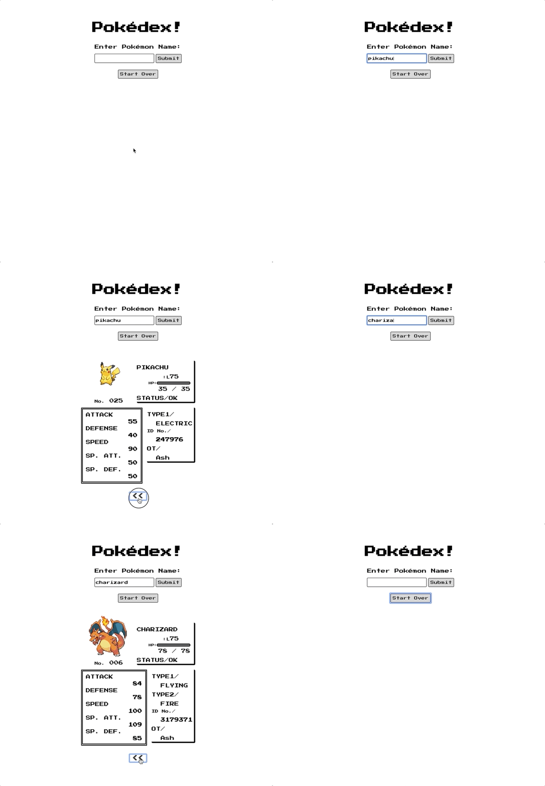
I was pretty happy with this version, but there definitely was room to improve: tiny details (boxes and Pokéball illustrations) on each component were missing, the position of the arrows was weird, the arrows on the stats component were missing, I didn’t have much good error handling (which is less visible but still important!), and the UX when awaiting a response from the API was pretty unhelpful.
Decision point: What did I want to prioritize while styling the application to avoid working on it forever?
Small deviations from the wireframes didn’t bother me too much - I was fine with having separate Special Attack and Special Defense categories and using metric measurements for Pokémon height and weight (the PokéAPI returns weight in hectograms and height in decimeters, for some reason, so converting those to feet/inches and pounds would have been a headache). I also left off the little arrows on the stats component borders.
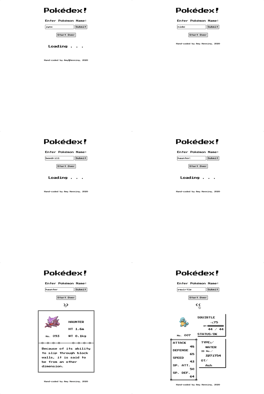
I invested a lot of time styling some more visual details and implementing a better UX while awaiting API responses and on invalid input. The whole thing involved quite a bit of experimentation, Googling CSS tricks, and trial and error (as engineering often does). The finished product wound up looking like this:
Deployment
Despite having a working app, I put off deploying it because I wasn’t sure how I wanted to do so. I knew of a couple options (namely, Heroku and Netlify), but wasn’t sure if I should research others to learn something new.
Decision point: How should I deploy the finished app to production?
Almost every personal project I’ve worked on in the past has been deployed with Heroku. The Heroku apps I’ve deployed in the past are pretty slow, though, and I was interested in trying something new.
I ultimately chose Netlify to deploy the app and register its domain name. While there are many options available and I could’ve spent more time practicing getting DNS and certificates set up, it just wasn’t the focus of this project. I also had been sitting on a complete project for a few days, and I just wanted to get it out into the world. There is nothing wrong with using existing tools to get a job done!
In addition to easy deployment and domain setup, I really liked that Netlify offers previews before a deploy and that the preview URLs essentially allow you to archive versions of your site. Their CLI was easy to use (I referenced this article). I’m also intrigued by their continuous deployment feature and plan to try it out with my personal site.
Wrapping Up
Tracking my process for developing this app proved how even an application as simple as this one contains many decision points (also that I can be indecisive!). I hope this post is helpful in illustrating the decision-making processes that engineers go through constantly. Feel free to check out the finished Pokédex at pokedexapp.com!
